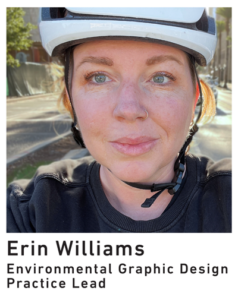
 As an environmental graphic designer, Erin Williams is an expert at visually communicating the personality and purpose of the places she designs. While much of her work involves wayfinding, it’s not purely utilitarian. She believes it’s important to go beyond signage standards to incorporate elements that express a community’s identity and encourage people to interact with their environment.
Erin also believes it’s important to get lost. To master the art of wayfinding, she needs to feel out the cues of getting found again. You can regularly find her in the mountains of the Angeles National Forest getting mildly lost (out of the danger zone, of course).
Read on to learn more about Toole Design’s new Environmental Graphic Design Practice Lead and how she approaches her work.
How did you become an environmental graphic designer?
I studied architecture and worked in that industry for a few years. But I was really interested in the space between a building and a person’s experience of it. What happens when a company moves into a building and makes it their own.
When I went back to school for my MFA, my interest turned even more toward getting a person to a building in the first place. Most journeys don’t happen within the scope of an architect’s work. Most of that journey happens in public space. That’s where we have the most power to shape the world around us into the world it needs to become over the next generations.
What does environmental graphic design have to do with active transportation?
Everything! Humans have a real normalcy bias. A lot of transportation conversations are about personal choice and logic, but I think a lot of choices are made based on what we perceive as being normal. The way we communicate, especially visually, can help normalize something that seems new or seems like it’s only for a special interest group.
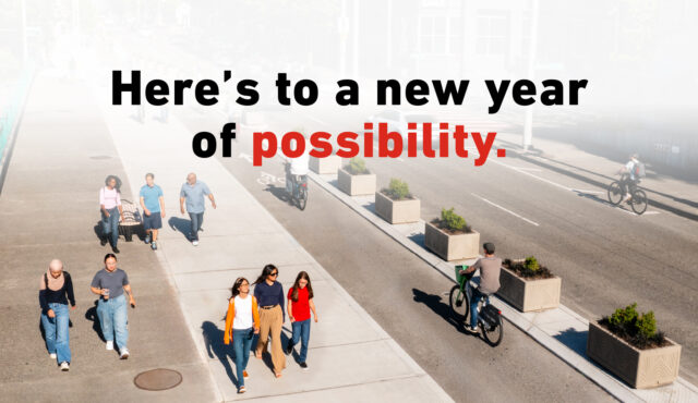
Getting people to understand and embrace change is a communication problem. If someone sees a new bike lane, are they going to think, “Oh no, are they narrowing our street?” or “Maybe I should try that!” The more our work helps make a streetscape feel welcoming and resonate with the values of that community, the more it gets embraced.
The way we communicate, especially visually, can help normalize something that seems new or seems like it’s only for a special interest group.
What projects are you excited about right now?
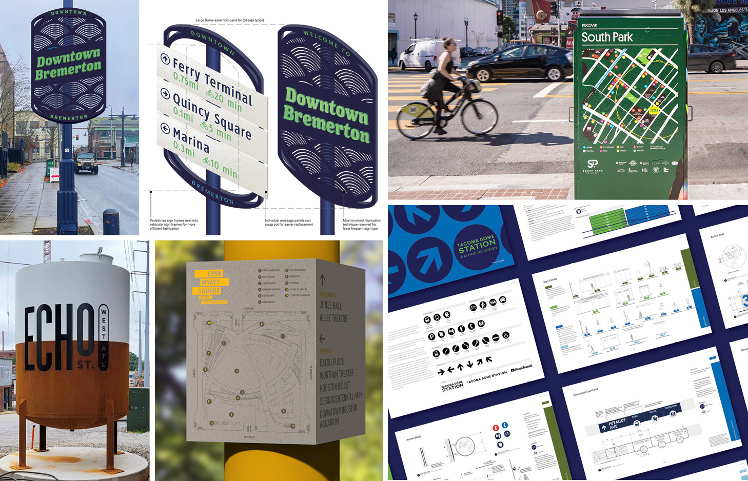
I’m very excited about a wayfinding concept we recently completed for Tacoma Dome Station in Tacoma, WA. The station has three different transit lines converging on site, and two others right across the street. With this project, we get to help people make sense of a very complex environment where they’re often in a rush, transitioning between transit modes. We’re unifying what used to be several competing signs and brand standards and refocusing not on who owns the line or the sign but on what the user needs in the moment. We’re taking what has been considered a collection of different transit lines and helping to turn it into a place.
How do you see your work contributing to climate resiliency?
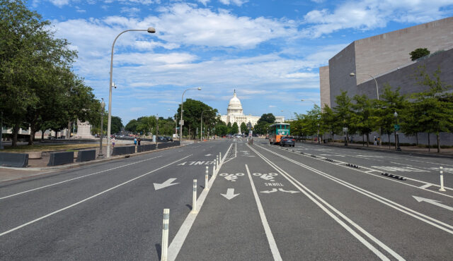
I think really carefully about materials. Material type is fundamentally related to sustainability, but I’m even more focused on making the most of every resource — using existing light poles, using bollards that are delineating a bikeway, instead of putting up a bunch of new things. I want to make everything we put in that environment work really hard to convey as much information, and as much personality, as it can.
What’s your favorite part of the day?
My commute! I live 3 miles from our Los Angeles office, and I bike in most days. My bike ride helps me arrive awake and refreshed and ready to go. And it means I arrive with opinions on all the things we are doing here!
What’s something people can’t find out about you from LinkedIn?
I love building things. I’ve designed and built most of my own outdoor furniture, laid all the hardwood flooring in my house, and learned firsthand how difficult it is to lay herringbone tile. I believe working with my hands makes me a better designer.
