Denison was the first rail town in Texas, and it has a rich history and traditions that give it a distinctive character. However, the city needed to attract new investment and energize the downtown to match its historic charm with accessible, people-focused infrastructure. The Toole Design Team was brought on board to help the community define its own vision, work side-by-side with residents to sketch designs that reflected that vision, distill those ideas into a cohesive strategy, and present final designs for construction.
A critical segment of the Main Street portion has now been built and Denison community members are beginning to enjoy a reimagined downtown. There is more space for pedestrians, bicyclists, trees, and furnishings—there’s a design aesthetic that complements the historical and regional aspects of the community and gives it a real sense of place.
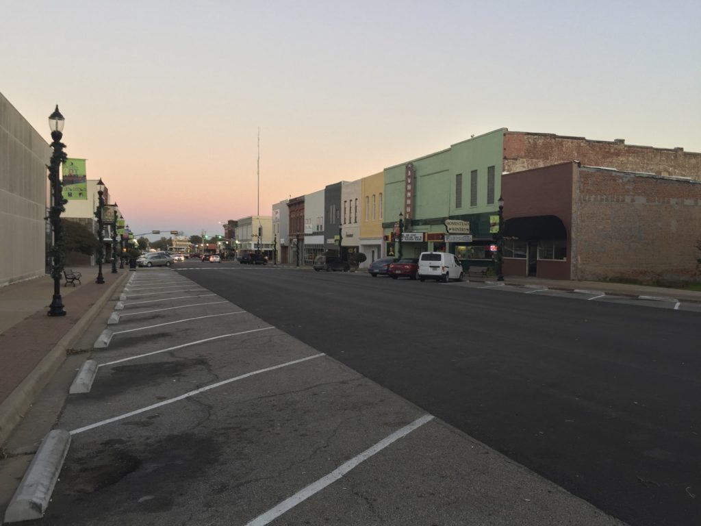
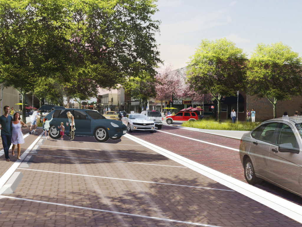
As a relatively small community of approximately 24,000 people, Denison’s residents were seeking to bring out the best version of their town—not to mimic the feel of a bigger city. The Toole Design Team’s attention to detail and dedication to the historical and environmental character of the region yielded a welcoming, comforting design that feels like it could (perhaps should) have been there forever.
From concept to design, this project was a collaborative effort with City staff and across Toole Design offices, including Eric Childs, Cindy Zerger, Bonnie Moser, Ian Lockwood, and Bill Schultheiss.
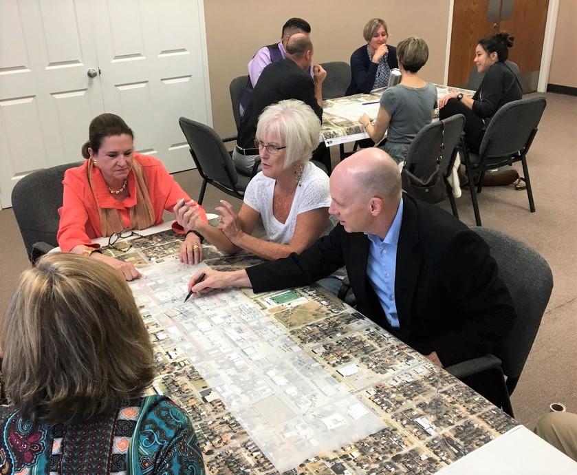
Read on to learn about the design features that are making downtown Denison more inviting, resilient, and accessible.
CURBLESS STREETS
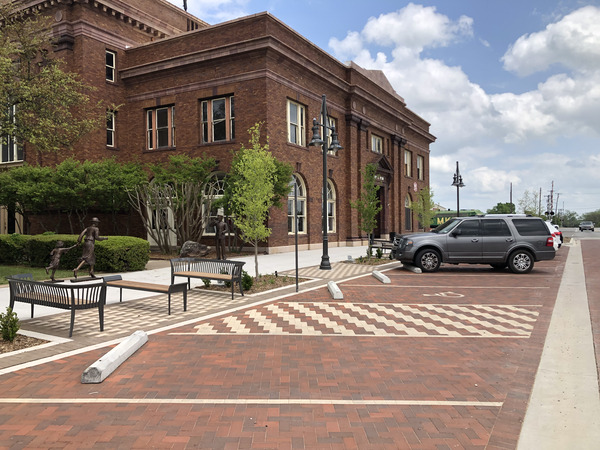
The Toole Design team worked from building face to building face on Main Street to reimagine and reallocate much of that public space to be more inviting and more usable for people walking, bicycling, driving, and socializing. The mostly curbless, or flush, street design creates a more accessible environment for people using wheelchairs or other mobility devices. It also makes the space more flexible for the many festivals and public events held downtown.
STREET TREES AND STRUCTURAL SOIL
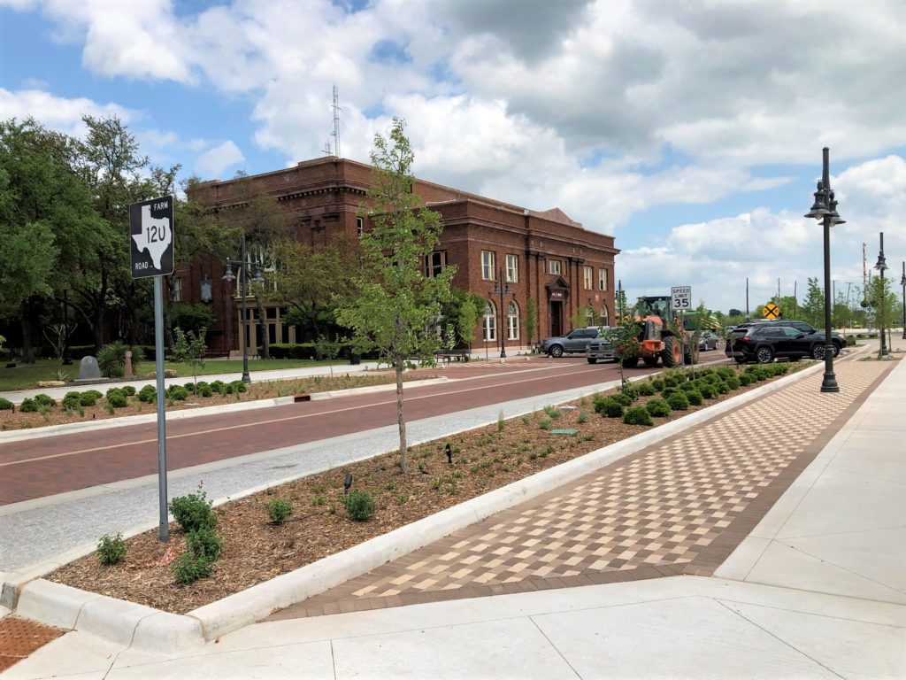
Our design includes a row of street trees on either side of Main Street, which will add charm and shade along the corridor. Even more exciting than the trees themselves—at least to us—is the innovative approach we took with the soil. Structural soil, an interlocking mixture of stones and particles, runs underneath the sidewalk. By using this type of soil and extending it continuously underneath the furnishing zone, the design gives the trees ample room to thrive and will ensure a healthy canopy for many years to come.
SPACE TO BREATHE
We were able to allocate more space for pedestrians by narrowing the travel lanes for cars. This includes not only space for people to walk side by side, but also a healthy furnishing zone. One often-overlooked aspect of accessibility is resting space. With added public space for benches and other seating, people can rest and take breaks in a comfortable, welcoming setting.
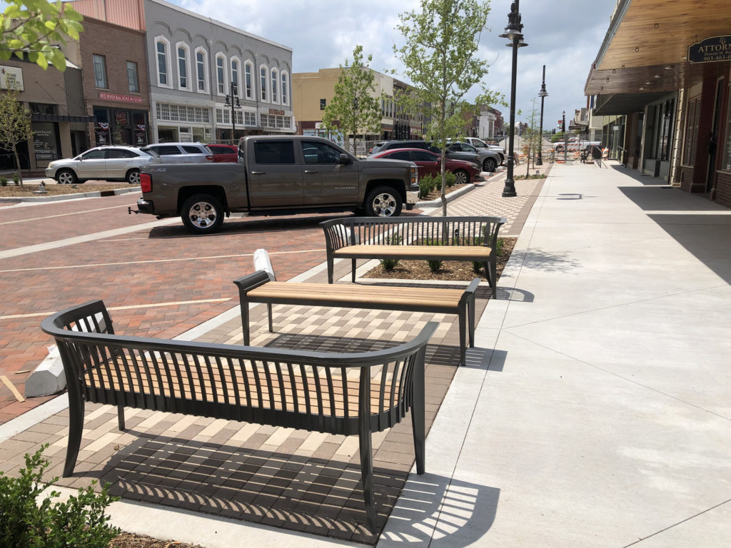
The new design also incorporates several pocket parks and the Top of the Town Park, a statement park on the site of the former high school. These green spaces will provide additional space for leisure and also contribute to a more climate-resilient Denison.
harmonious aesthetic
We chose colors and materials to reflect the landscape and complement the existing building facades and were able to create a design to fit in with the North Texas setting. The warm palette we selected for the brick paving in the furnishing zone meshes well with the brick in the street and parking zones. And the new entry sign is, of course, made of Texas limestone.
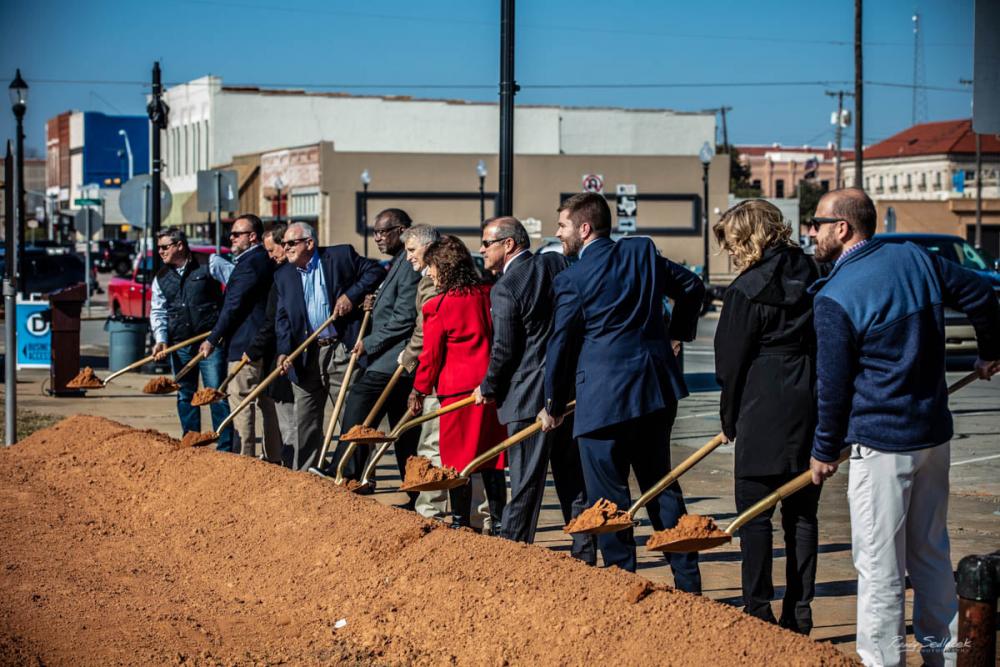
The project in Denison is in phase one of implementation, so there is still more to come as this historic rail town revamps its downtown. We’re excited to see future phases unfold—and to apply similar design principles to help other cities large and small realize their visions.
