By Fred Lippert and Dan Reed
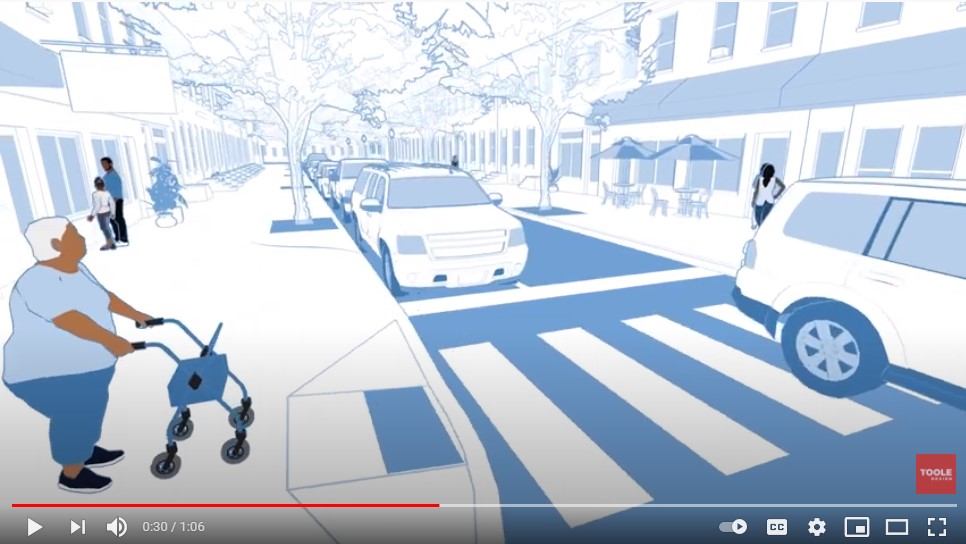
When picking a good book to read in a cozy corner with a favorite drink in hand, not even the most dedicated design professional would look for a technical reference manual filled with details on corner radii, land-use context, and project prioritization tables. So how does one generate public interest – excitement even – about a Complete Streets manual? How do you reflect years of professional experience steeped in technical jargon in a catchy, concise form that is easy to access and able to provoke curiosity? Toole Design faced these questions as we worked to creatively deliver and promote the City of Baltimore’s Complete Streets Manual. Our answer: a one-minute animated short film that draws you into the story of the manual.
Let’s start at the very beginning. Baltimore City Council passed a groundbreaking Complete Streets Ordinance in 2018, which introduced binding requirements to integrate equity throughout transportation project selection, development, implementation, and evaluation. The ordinance elevates equity from a policy goal to a core element in how the City plans and designs its transportation infrastructure. To put the ordinance into practice, the City adopted its first ever Complete Streets Manual in March 2021.
When Toole Design began work on the manual with the Baltimore City Department of Transportation (BCDOT), they made it clear that the manual should reflect the people and the uniqueness of Baltimore. Both the content and illustration should seamlessly guide City staff, property owners, and citizens to understand how to create safer, more comfortable streets for all users, and how doing so helps correct systemic underinvestment in communities of color.
Toole Design addressed this challenge by featuring local landmarks, vernacular architecture, and classic Baltimore street scenes in all the graphics. Our collection of Street Types provides guidance tailored to Baltimore, including a “Shared Street” representing the city’s many narrow alleys where people walking and riding scooters mingle with slow-moving motor vehicles.
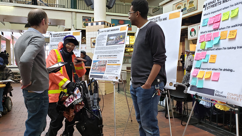
From the beginning, Toole Design engaged with a broad swath of Baltimore’s diverse communities to solicit feedback about street users’ needs to incorporate appropriate design solutions into the manual. Our outreach strategy began with pop-up events in places where people were already meeting, such as the famous Lexington Market and other public markets. These interactions gave us a better understanding of community concerns and resulted in changes such as expanding the topic of safety to include improved maintenance of streetlights and cracked sidewalks.
As we began our next phase of community gatherings in early 2020, with Covid-19 still waiting in the wings, residents asked us if we would have a virtual version of the meeting because it would be difficult for them to reach the meeting location downtown. That’s when it clicked for us: we were talking to people about how they get around Baltimore, and even before the meeting, they were telling us just how challenging that could be. If pop-up meetings brought us to the places people already go, virtual meetings brought us to their living rooms and front porches. We immediately pivoted and held our first online meeting in April 2020.
Much to our surprise, our virtual meetings actually drew 25% more attendance than our in-person meetings. One reason was because our community partners – ranging from a South Baltimore business group to a West Baltimore advocacy group to an East Baltimore community who wanted traffic calming – were already getting residents accustomed to the platform for their own meetings. As more people got used to virtual meetings, we saw higher turnout, and were able to have longer and more substantive conversations or do interactive activities like walking tours in Google Street View.
There remain significant barriers to participating in virtual meetings, especially without the help of community-based organizations. Fully 40% of Baltimore households lack broadband internet access, and one-third of households lack a computer. But they also lowered many other barriers for people who previously could not participate in in-person meetings, whether due to transportation, building accessibility, time, childcare needs, or even their comfort level with public speaking. Ultimately, they led to a more robust conversation about Baltimore streets and a higher quality of feedback that made our manual more responsive to the community.
While we achieved greater attendance online than at our in-person meetings, this format exposed the need for a succinct, visual message to address the most common question from participants: What does this mean for me?
Toole Design answered this need with the idea of creating what amounts to a brief “movie preview” for the manual, one that could both explain what it’s about and generate excitement about its meaning for city residents. To keep costs low for this late stage addition, we used the tailored-to-Baltimore illustrations from the manual as the foundation for the animation work, providing visual continuity between the two.
Toole Design staff challenged themselves to distill the technical core of the manual into a simple script and visually comprehensible vignettes that portrayed relatable everyday experiences. We intentionally selected Baltimore scenes that would be recognizable and relatable to the widest audience, allowing for broad understanding of how the manual’s technical concepts could lead to visible, positive change. Deliberate attention was given to the demographics of the cast of characters to ensure they reflected the majority Black city of Baltimore, while also highlighting the manual’s consideration of the unique challenges faced by people who use walkers or wheelchairs.
We incorporated subtle cues to help the viewer connect their everyday experiences in Baltimore with what they were seeing and hearing in the film. From choosing a narrator specifically for his regionally familiar voice to keeping the Maryland MTA buses’ color scheme, we aimed to highlight the sense of place while emphasizing transit’s increased priority level in Baltimore’s new modal hierarchy.
Ultimately, the heart of any Complete Streets manual is in its ability to guide decisions about how to allocate limited resources equitably when city street changes are required. Its success depends on whether the people for whom it was created are able to envision the benefits it prescribes and use it to advocate for the changes they want to see in their streets, neighborhoods, and city. Thinking creatively about meaningful visual communication allowed Toole Design to aspire toward a more successful Complete Streets Manual, one that Baltimoreans would understand is dedicated to improving their everyday lives.
Note: Article written by Fred Lippert, PLA and Dan Reed; animation by Spencer Boomhower.

